Occasionally, when we start a logo design project, the following occurs:
Client: “It has to have red in it. And yellow! Maybe purple…….”.
Gilday Creative: “Nope, the initial logo design concepts will be in black and white. Once the design is approved, then we can see how color plays a role.”
Client: “No, no, no. I need something that pops!”
Gilday Creative: “One, logos don’t pop like you’re opening a champagne bottle. Two, colors can be a distraction to the design process and the logo design needs to be strong enough on its own. Furthermore, there may be times the logo will not have the option of color, such as periodicals, checks, or high cost color printing.”
Client: “So, first the logo design, then the we work on the colors?”
Gilday Creative: “Correct. Then you’ll get the colors you like. Well, maybe not chartreuse”.

So, our logo design process starts in black and white and then evolves to include color. This results in a very strong design that doesn’t rely on color alone. Although color can be an important part of a logo, it doesn’t have to be essential. Black and white projects an air of sophistication such as tuxedos or penguins. Penguins are VERY sophisticated, dressed in formal attire even during the day. Anyway, some companies actually have evolved over time from colored logos to monochromatic or black and white. Apple’s logo went from a spectrum of colors to all black or all white.
An example of one our logo designs that we intentionally kept black and white was for the 2017 Taste of New Paltz. The black and white logo makes it easily legible, but possesses an uneven gritty chalk texture which compliments the bold red and black color scheme of the overall event. When appropriate the white chalk of the logo was inverted to black when the background needed to be a lighter color or white, such as for website graphics and on T-shirts.
One of the reasons we start in black and white is because there may be times where a multi-colored logo may be expressed in black and or monochromatic in certain mediums:
- Periodicals with high multi-color printing costs
- Checks
- Engravings and etchings
- Receipts
- Promotional materials
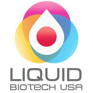
Below is an example of one of our client’s logo first in black and white and then in color. The logo is very similar to a drop of water or a drop of blood. The aim of their technology is to determine if a patient has cancer by analyzing a drop of their blood. So, the drop imagery conveys how the technology works and represents the name of their company. For the color logo, the center of the drop is a round red circle representing blood, similar to how it would appear on a diagnostic slide. The color scheme behind the drop gives it a strong background to view the drop easily while giving the logo warmth and differentiating itself from some competitors’ cold logo designs. Both images have great contrast and are legible, giving them both a dynamic presence based on the medium they are presented on.
By focusing on the logo design first and not its color scheme, the design will be able to stand on its own in any medium. However, as marketing becomes more digital, avoiding high multi-color printing costs or promoting in other mediums may be a moot point. And, we’re not saying color doesn’t add to a logo’s value. It’s our design process that focuses first on the design, then the color scheme; not as an afterthought, but as a secondary attribute that compliments the design.


