
Client Need
A nonprofit veterans reintegration program needed a website redesign as the old site had no branding for the organization and had sparse content for Search Engine Optimization (SEO).
The Hudson Valley is home to over 12,000 veterans and their family members. The Veterans Wooden Boat Workshop is an organization founded by Veterans dedicated to the well-being of Veterans and their families. While veterans do have access to programs that assist in homelessness, substance abuse, employment, and other basic needs, their organization’s goal is to fill in any gaps of services. This Workshop is a program that integrates cognitive behavioral therapy techniques and access to support professionals to help Veterans successfully reintegrate into society as well as teaching a viable skill in woodworking and watercraft.

Gilday Creative Plan
We, first, designed a logo to elevate the organization’s branding. From there, we updated their website to focus on the nonprofit’s goal and mission of its boat building program for veteran reintegration.

The Results
BRANDING
The organization had a logo, but it benefited by being updated. The new logo retained the original theme of a compass but it was simplified by removing the cardinal and inter-cardinal labels of N, NE, E, SE, etc. In the background, an anchor with clean simple lines was added to reinforce the organization’s marine theme. Finally, the logo has off-white, blue, and red accent colors as an acknowledgment to the military and the American flag.
WEBSITE DESIGN
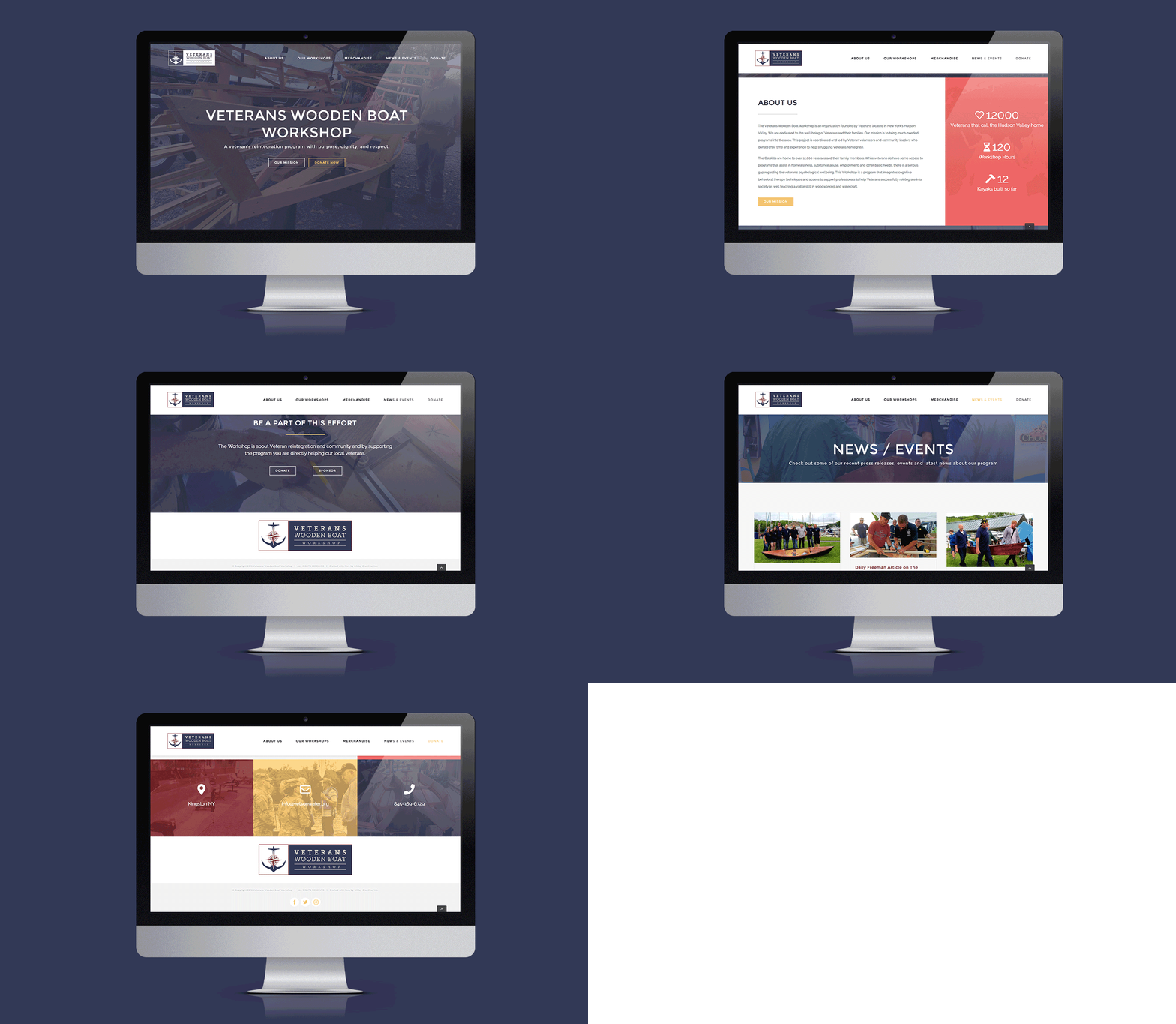
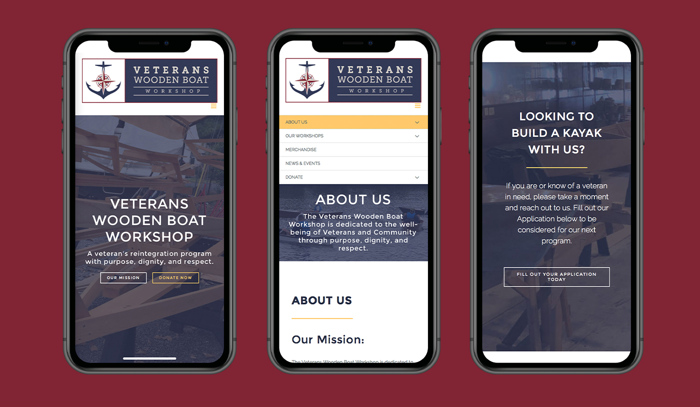
The website needed extensive updating as it did not contain any branding, images of its organization or its activities, or the appropriate amount of copy for strong SEO. We rearranged the site map to bring focus about the organization and removed irrelevant pages that brought no value. In addition, we made the horizontal version of the logo to be a link to the home page, located at the top left and center bottom of every page. And, we added a bit of flourish with the logo colors as website visitors scroll down the page, the black and white logo with the white top navigational lettering transitions to the color logo and black top navigational lettering.
As the visitor continues to scroll down, animated counters are displayed on the right to showcase interesting statistics of the organization. The great thing about the animated counters is that it immediately draws visitors’ eyes to important information and volunteers can change the categories to highlight future information that becomes more critical. Also, there is a slight Parallex effect as the foreground text moves slightly faster than the background images.
